Data Visualization is Essential to R&D
When the journal Frontiers in Bioinformatics announced a new publication venue dedicated to data visualization two years ago, it took a clear stance: Data visualization is not about aesthetics. It should not be viewed as optional.[1] Rather, visualization is an essential aspect of research that is necessary for data interpretation and collaborative innovation. Specialty Chief Editor for Data Visualization, Sean O’Donoghue, wrote:
“Increasingly, the life sciences rely on data science, an emerging discipline in which visualization plays a critical role. Visualization is particularly important with challenging data from cutting-edge experimental techniques, such as 3D genomics, spatial transcriptomics, 3D proteomics, epiproteomics, high-throughput imaging, and metagenomics. Data visualization also plays an increasing role in how research is communicated. Some scientists still think of data visualization as optional; however, as more realize it is an essential tool for revealing insights buried in complex data, bioinformatics visualization is emerging as a subdiscipline.”[1]
Let’s take a closer look at why visualizing biological data is so important to R&D.
Interpretation: Data visualizations help us understand complex information
In life science R&D, we are dealing with massive volumes of diverse data types. The data are noisy, complex, and interconnected. Analysis methods are intricate and recursive. And while what data we have is clearly important, how those data are presented can have a profound impact. It is next-to-impossible to rely on tables alone. Visualizations, on the other hand, can help us more easily understand complex data. Why? Quite simply, our brains are wired this way.
A larger portion of our sensory cortex is devoted to visual processing than to word processing.[2] Our brains can process around 10 million bits per second and can visually recognize patterns within about 100 milliseconds.[1,3,4] As such, visualizations help us better understand and retain information, making them great aids in conveying complex concepts.[2] In fact, in a recent study published in Nature Communication, researchers from the University of Sydney, University of Queensland, and University of Cambridge explained how the brain’s visual processing system is akin to a Bayesian model that processes prior knowledge with new evidence to make intelligent inferences.[5,6]
Despite this, data visualization hasn’t always been a priority. As expert Nimita Limaye explains in Technology Networks Biopharma, “While real-time access to diverse sources of data has been viewed as the greatest benefit of this generation, not enough consideration has been given to the challenges faced by the end user[s] in trying to wade [their] way through those innumerable and confusing data points.” But a change is underway. Limaye explains, “There has been a paradigm shift from viewing data as static plots to dynamic 3D visualizations, which enable deeper insights into the interplay of different parameters.”[7]
Let’s take a look at a few examples of how data visualization aids in complex data interpretation in biology R&D.
Genomics Visualization - Circos Plots
A good example to illustrate the importance of data visualization is circos plots, which can be used to visually display complex genomics data in order to aid in interpretation of large volumes of data.[8-10] While linear plots, or even stacked tracks, are certainly useful for scrutinizing specific regions, researchers often need a more global view, including non-adjacent regions, to understand the relationships amongst different data. [10]Circos plots can help achieve this. They can present complex genomics data by visually laying out different data tracks around a circular plot using various visual elements, such as color schemes, fonts, distances, sizes, etc. For example, as shown in Figure 1, chromosome-based circos plots can display various data points (e.g., variants, expression data, different peaks) for different chromosomes around a circle, where each segment of the circle represents a specific chromosome.[9] With Circos plots, researchers can see a more complex and complete picture of their data, helping them better interpret complex multidimensional data, such as expression patterns, somatic mutations, epigenomic profiles, structural aberrations, copy number mutations, clinical information, etc.[10] Careful selection of what data points are displayed is essential to avoid inundating the analyst, and having easy-to-use tools for creating, updating, and interacting with the graphs, as well as accessing the underlying raw data, is key to interactive analysis.
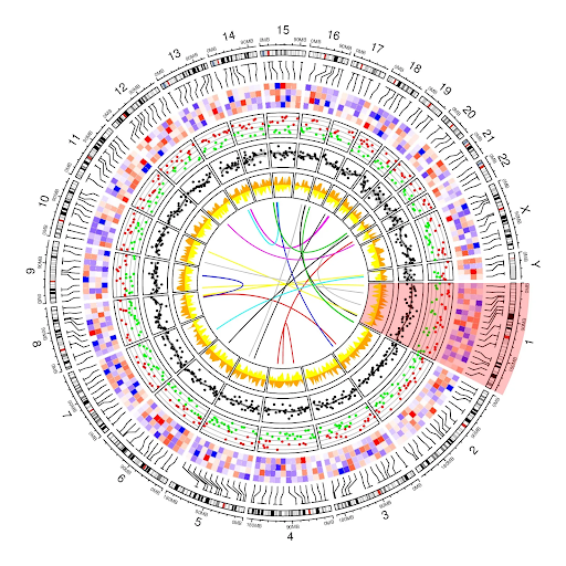

Figure 1: With Circos plots, numerous data points for different chromosomes can be pulled from multirow and multicolumn tables, aggregated, and visually plotted for easier interpretation. (Image credit: Nattestad, M. Medium. 2017).
The Cancer Genome Atlas - Data Visualization Tools
Another great example to highlight the importance of data visualization in complex data interpretation is The Cancer Genome Atlas (TCGA).[11]. TCGA is a joint initiative between the National Cancer Institute and National Human Genome Research Institute that aims to catalog the genetic mutations responsible for cancer. Since 2006, researchers across diverse disciplines and institutions have been creating and sharing scores of sequencing and bioinformatics data in an effort to characterize different tumor types.[11] In fact, over 2.5 petabytes of genomic, epigenomic, transcriptomic, and proteomic data have been created.[11] To help make sense of all this data, TCGA researchers and collaborators have created numerous data visualization tools, including tools for proteomic-data visualization, cancer-genomic visualization, expression-level exploration and mutation analysis, integrated-genomics-data visualization, regulome data visualization for exploring clinical-molecular data associations, and tumor mapping (as highlighted in the Figure 2).[12] Without tools like these, making sense of this volume of data would be impossible.
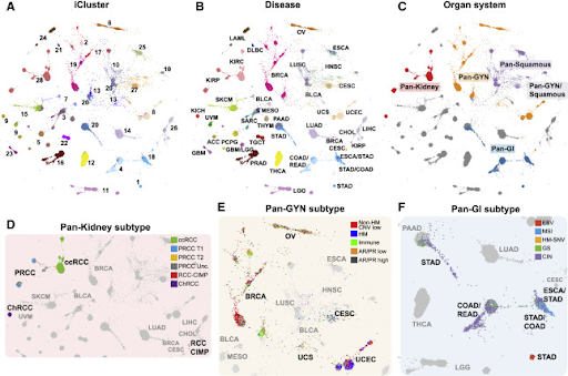
Figure 2: TumorMap—an interactive portal for visualizing high-dimensional omics data in a two-dimensional projection (rendered with the Google Maps API)—helps researchers uncover associations between sample groupings and clinical, phenotypic, and molecular event annotations.[12] In the example shown here, researchers used TumorMap to explore molecular similarities among histologically or anatomically related cancer types within 10,000 specimens from TCGA. (Image credit: Hoadley, K.A., Yau, C., Hinoue, T. et al. Cell. 173 (2), 2018.0).[13]
Innovation: Data visualizations support collaborative innovation
However, the high quantity and complexity of data in life sciences complicates matters. R&D organizations often have a wide range of experts using a variety of specialty technologies to create and analyze diverse types of data. On top of this, the data-science lifecycle—like the innovation lifecycle it mirrors—is an interactive process, as illustrated in Figure 3. Raw data are repeatedly created, acquired, analyzed, rendered, and observed as insights are gained and new hypotheses are pursued.
To mitigate data reproducibility issues, researchers must be able to track and share all the settings they used to create data that led to meaningful discoveries, so other colleagues can easily repeat their analyses. As such, an essential underpinning to data visualization is having a data platform that can collect, integrate, and interpret data (and metadata) from diverse sources. Without it, will not maximize the return of the investment of the incredible amounts of time gathering, organizing, collating, analyzing, and rendering data – either themselves or with the help of already overburdened data scientists; this bottleneck directly counteracts the benefits of using visualizations to quickly gain insights and make decisions.

Figure 3: Visualization is key to gathering insights as data are continually produced, integrated, and analyzed during the data-science lifecycle. (Image Credit: O’Donoghue. Frontiers in Bioinformatics. 1, 2021)
Conversely, when a scientific-data-aggregation-and-management platform is joined together with powerful data visualization tools, teams gain self-service access to their data like never before possible; they can more easily connect diverse datasets, create dashboards and visualizations for their unique needs, and drill down into raw data. The result? Teams can cut through the noise; they can quickly access data; spot trends, patterns, and hidden connections; identify outliers or knowledge gaps; know what questions to ask next and what avenues to explore – across many data types. They can view and share their data in different ways, making it easier to collaborate with other experts and, eventually, share their breakthrough discoveries with the world. Limaye echoed this point in her article, writing, “The future of data visualization is about making the process more dynamic and fueling the creative instincts of scientists by allowing them to play around with the data.’[7]
Dotmatics Luma – Connecting Diverse Raw Data and Interactive Visualizations (COVID-19 Immunophenotyping Example)
To illustrate the importance of having a data platform that unites diverse data sources with powerful visualization tools, we can use COVID-19 immunophenotyping as an example.
Early in the pandemic, an extensive team of collaborative researchers aimed to improve the understanding and management of COVID-19 by using flow cytometry to scrutinize cell-population data from blood samples taken from highly heterogeneous COVID-19 patients who required hospital treatment.[14] Their goal was to uncover factors that are linked to symptom occurrence, severity and clinical progression, which could thereby help guide risk-based patient-treatment protocols.
These researchers went through an incredibly time-consuming data wrangling process to collect, model, process, and visualize vast amounts patient and results data, which they’ve since made available within the Covid-IP (Covid–ImmunoPhenotype) project.[15] If they’d had Dotmatics Luma, they could have eased some of that burden and freed time for scientific analysis. As shown in the images below, Dotmatics Luma simplifies the steps needed to transform raw data into interactive visualizations, putting scientists in control. It enables all key steps—from collecting raw data (Figure 4), to creating data tables and models (Figures 5-6), to outputting data for interactive visualization (Figure 7). Dotmatics Luma preserves the data connection from raw data all the way to rich visualizations. This means that teams attain a striking level of interactivity. Scientists and statisticians alike can easily spot trends across collated and modeled data, as well as dig down into the raw data for deeper understanding.
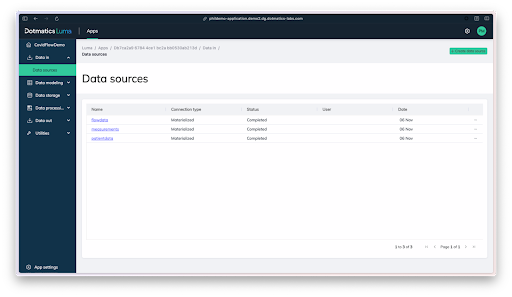
Figure 4: Dotmatics Luma makes it easy to collect files from diverse data sources, such as the patient data, raw flow data, and analyzed data in this COVID-19 immunophenotyping example.
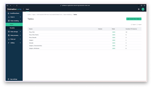
Figure 5: Scientists can then use Luma to design a logical data model to help collect and organize the data in a way that makes sense for analysis.
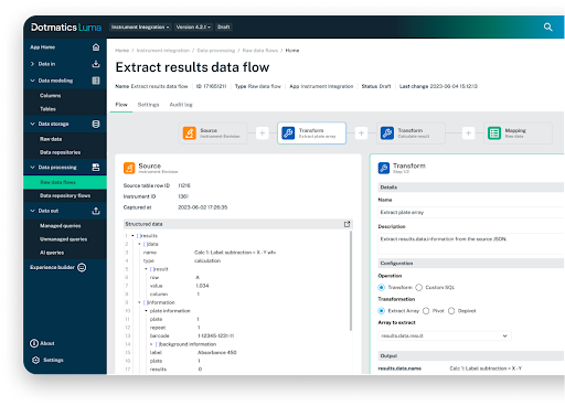
Figure 6: Luma data flows then transform and move data from the raw format into the data model.
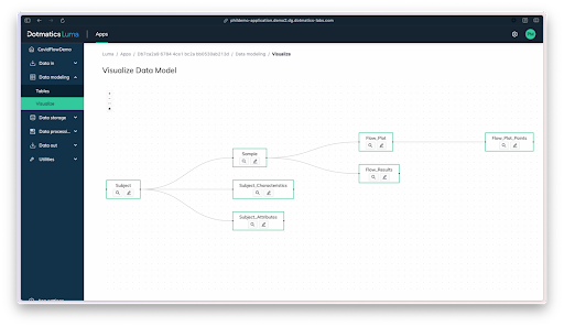
Figure 7: A visual of the data model created with Luma.
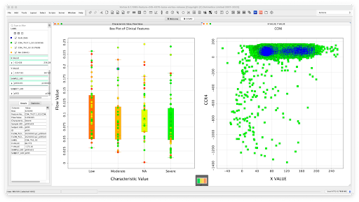
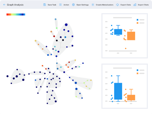
Figure 8: Dotmatics Luma can flow data directly into interactive visualization tools that let users more easily spot trends and see patterns, while also enabling them to dig all the way back into the original raw data; in this example, COVID-19 immunophenotyping data, including flow cytometry results and clinical data, were pushed into Dotmatics Vortex, a business intelligence solution for powerful scientific data visualization and analysis.
Data Visualization with Dotmatics
As the processing power available to us exponentially increases and advanced analytics like ML/AI become the norm, data visualization will help bridge the gap between computers and humans. It will play an essential role in helping us interpret an outpouring of advanced-analytics results so that we can more easily see what happened, understand why it happened, and predict what might come.
Dotmatics is here to help you better access, understand, and apply all of your complex R&D data. In addition to our scientific-data-aggregation-and-management platform, Dotmatics Luma, we offer a wealth of data visualization solutions for different scientific modalities, including:
Specialty research visualization: Scientific visualization tools for biologics, small molecule, and chemicals and materials research
Publication-quality reporting and visualizations: Statistical analysis, graphing, and publication-quality reporting with GraphPad Prism
Decision-support visualizations: Advanced data visualization and analysis for decision support with Dotmatics Vortex
Contact us today to discuss how Dotmatics can help propel your innovation by improving your data aggregation and data visualization capabilities.
References
O'Donoghue, S. Grand Challenges in Bioinformatics Data Visualization. Front. Bioinform., 17 June 2021. (1) https://doi.org/10.3389/fbinf.2021.669186
Kouyoumdjian, H. Learning Through Visuals - Visual imagery in the classroom. Psychology Today. July 20, 2012. (Accessed October 20, 2023).
Koch, K., McLean, J., Segev, R., Freed, M. A., Berry, M. J., Balasubramanian, V., et al. (2006). How Much the Eye Tells the Brain. Curr. Biol. 16, 1428–1434. doi:10.1016/j.cub.2006.05.056
Healey, C. G., and Enns, J. T. (2012). Attention and Visual Memory in Visualization and Computer Graphics. IEEE Trans. Vis. Comput. Graph. 18, 1170–1188. doi:10.1109/TVCG.2011.127
Evolution wired human brains to act like supercomputers. ScienceDaily. September 14, 2023. (Accessed October 20, 2023).
Harrison, W.J., Bays, P.M. & Rideaux, R. Neural tuning instantiates prior expectations in the human visual system. Nat Commun 14, 5320 (2023). https://doi.org/10.1038/s41467-023-41027-w
Limaye, N. Data Visualization in Biopharma: Leveraging AI, VR and MR to Support Drug Discovery. Technology Networks Biopharma. June 12, 2019. (Accessed October 20, 2023).
Krzywinski M., Schein J., Birol I., et. al. Circos: an information aesthetic for comparative genomics. Genome Res. 2009 Sep;19(9):1639-45. doi: 10.1101/gr.092759.109.
Nattestad, M. Making genomic data come alive with circos plots. Medium. September 25, 2017.
Visualizing Genome: Creating Circos Plots. Bioinformatics & Research Computing. Whitehead Institute. (Webpage: Accessed November 6, 2023.)
The Cancer Genome Atlas Program (TCGA). National Cancer Institute - Center for Cancer Genomics. (Webpage: Accessed November 6, 2023.)
TCGA Computational Tools. National Cancer Institute - Center for Cancer Genomics. (Webpage: Accessed November 6, 2023.)
Hoadley, K.A., Yau, C., Hinoue, T. et al. Cell-of-Origin Patterns Dominate the Molecular Classification of 10,000 Tumors from 33 Types of Cancer. Cell. 173 (2), 2018. https://doi.org/10.1016/j.cell.2018.03.022
Laing A.G., Lorenc A., Del Molino Del Barrio I., et. al. A dynamic COVID-19 immune signature includes associations with poor prognosis. Nat Med. 2020 Oct;26(10):1623-1635. doi: 10.1038/s41591-020-1038-6.
Hayday, A., Edgeworth, J., Shankar-Hari, M. Covid–ImmunoPhenotyping - a preliminary data release. COVIDIP - Infection, Immunity, Immunophenotyping. May 22, 2020


